The geek wanted data. The manager wanted a decision.
A visitor counter could tell me that somebody arrived.
It couldn’t tell me whether the right people were visiting, what genuinely interested them or which signal deserved my attention.
That is where my professional personalities started arguing.
The data geek in me wanted to measure campaigns, behaviour, timing, engagement, devices—and probably something nobody had asked for yet.
The manager in me had a simpler question:
Interesting. But what decision will this improve?
And the former director added one condition:
Please don’t build another dashboard I need to check every morning.
I wanted the website to answer practical questions:
- Where did visitors come from?
- Which campaign or publication brought them?
- What created genuine engagement?
- Which actions suggested real interest?
- Did somebody choose a direct contact route?
- Could I trust the signal—or was it my own activity or a bot?
These are website questions, but the pattern is familiar across many businesses.
Showing the number is rarely the most difficult part.
The difficult part is understanding what changed, whether it matters and what somebody should do next.
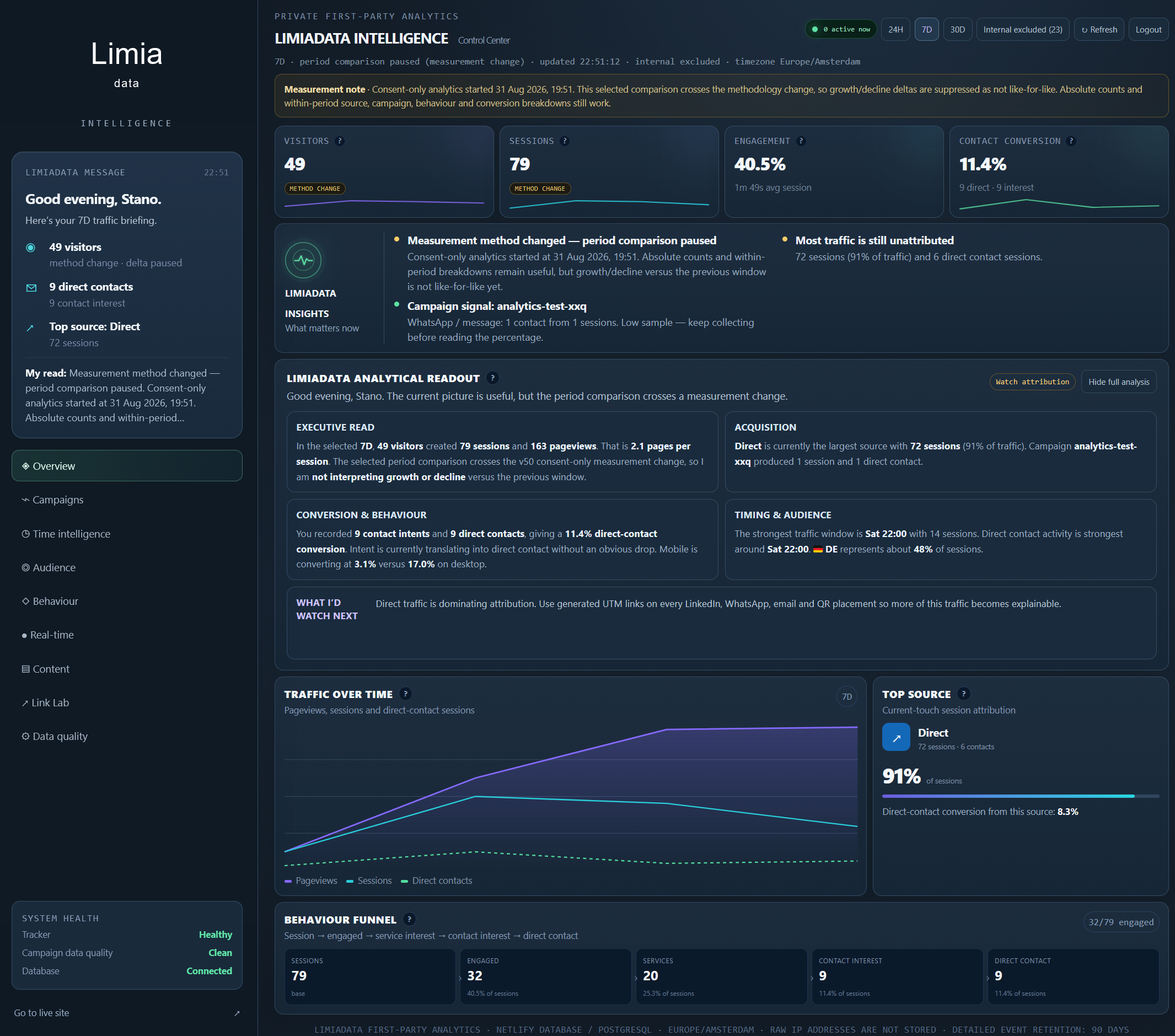
That became the objective: not another traffic dashboard, but a small decision-support system.
Not every click deserves a management meeting
One of the most important decisions was separating different levels of behaviour:
- Session
- Engaged
- Services
- Contact interest
- Direct contact
A pageview is a weak signal. Somebody may have opened the page and disappeared a few seconds later.
Engagement is stronger because the visitor spent visible time or explored further.
Viewing services suggests more specific interest.
Opening a contact route represents contact interest.
Choosing a direct contact action is the strongest signal in this journey.
The dashboard: We received another click.
The manager: Lovely. Does it mean anything?
Keeping these stages separate prevents an encouraging-looking chart from exaggerating reality.
The same principle applies in sales, recruitment and operations. Different actions represent different levels of intent. A useful model should preserve those differences instead of compressing everything into one impressive-looking KPI.
More data was not the answer. Better trust was.
Before adding more visualisations, I wanted to trust what was underneath them.
LimiaData now uses consent-first first-party analytics with data minimisation and automatic retention controls.
Optional analytics is off until a visitor actively chooses Allow analytics. Choosing No thanks keeps it off, and the choice can later be changed or withdrawn.
Only after permission does LimiaData create random session and browser identifiers and begin measuring page use, campaign and referrer information, broad device and country context and selected interactions.
Raw IP addresses are not used as analytics identifiers. City is not stored, and exact screen dimensions are replaced by broad categories.
My own internal visits and obvious bot activity are excluded from normal Intelligence reporting. Detailed active analytics events follow a 90-day retention policy with daily automated deletion.
These controls reduce unnecessary collection.
They also improve the signal.
The geek: We could collect more.
The manager: Can we first trust what we already have?
For a smaller business, a limited set of reliable and understandable signals is often more valuable than a large dataset nobody completely trusts.
Please don’t make the director watch another dashboard
The private LimiaData Intelligence Center holds the detailed evidence: traffic, campaigns, behaviour, timing, conversion signals and data quality.
But the dashboard is not the final product.
Numbers and charts show what happened.
Written interpretation explains what changed and what deserves attention.
When somebody opens a direct contact route, Telegram sends only a minimal signal. The detailed source, campaign, behaviour and device context stays inside the private Intelligence Center.
In other words:
The dashboard holds the evidence. The interpretation explains it. The alert interrupts me only when necessary.
Together, they create a simple loop:
Measure → interpret → alert → decide → learn
When the available information is limited, the system says so. It uses wording such as Early sample or Collecting signals instead of pretending that three visits and one click represent a groundbreaking market trend.
Small samples can still be useful.
They just shouldn’t pretend to be conclusions.
A method change is not a business change
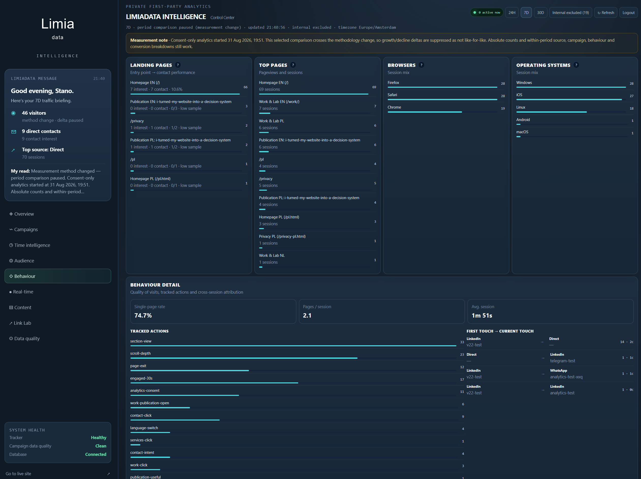
Moving to consent-only analytics created a new measurement baseline.
That matters because changing how you measure can look exactly like a change in performance.
LimiaData Intelligence marks the measurement boundary. When a comparison crosses it, the dashboard shows Method change instead of confidently announcing that traffic increased or collapsed.
Normal comparisons resume when both periods use the same measurement method.
This may sound like a small technical detail.
It isn’t.
A dashboard should distinguish between something changing in the business and something changing in the way the number was calculated.
What the project taught me
The biggest lesson wasn’t really about website analytics.
It was that an analytical product should start with the decision, not the dashboard.
Three questions now sit behind the system:
- What changed?
- Can we trust the signal?
- What should happen next?
That is also how I approach LimiaData projects.
The objective isn’t to add another reporting layer or produce more colourful charts. It is to connect business questions, trustworthy data, interpretation and practical follow-up.
This article is now measuring itself
Preparing this article exposed one more practical problem: entering every block manually, three times, for English, Dutch and Polish.
It worked.
So does carrying water in buckets.
I changed the Content Manager so one validated JSON package now creates the complete Draft in all three languages, including image placeholders. The pictures and final judgement still stay human.
That publishing workflow deserves its own article. Here, it is simply another reminder that repeated friction is usually a design signal.
After publication, I’ll create separate tracked links for my personal LinkedIn profile and the LimiaData company page.
The campaign will become the beginning of a clean consent-only learning baseline:
- Which LinkedIn message attracts relevant visitors?
- Do consenting visitors read the complete story?
- Which profile creates stronger engagement or intent?
- Does the publication time make a difference?
- What should the next article test?
The dataset will intentionally not represent every visitor.
That is fine.
Good analytics is not about claiming perfect visibility. It is about making better decisions from the signals you can trust.
So this article isn’t only describing the decision system.
It is the first real experiment running through it.
Does your dashboard answer “and now what?”
If your reporting shows the numbers but still leaves you wondering what deserves attention, I’d be interested to hear about it.
LimiaData helps turn scattered data, recurring reporting and unclear signals into practical dashboards, analytics and decision support.
Does your dashboard only show what happened—or does it help you decide what to do next?